|
Submitted by: Trigger By looking into the Tiles viewer of the emulator MEKA, Trigger noticed this small change in a sign in the level. Although it doesn't appear until Act 2, which isn't avaliable, it can still be seen. The arrow is used inside the cave area of Act 2. The one below it is what actually appears in the final game. Coincidentally, neither sign appears in the Master System version since you can see where you're going due to the larger screen. |
|
|
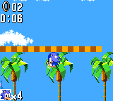
Submitted by: Rlan At the beginning of the avaliable Act, this small piece of strip can be seen in the air above you. It does nothing when you come into contact with it, and is probably a small glitch left over from the porting. |
 |
|
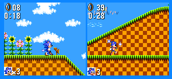
Submitted by: Rlan As another left over from the Master System version, Sonic still contains the [rather bad looking] invincibility stars which seem to squash themselves into a small circle near Sonics chest. The final game has 4 stars surrounding Sonic, as the right picture shows you. |
 |
|
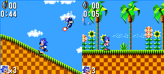
Submitted by: Rlan Most noticably, Sonic's sprites are drastically different to that of the final Game Gear game. This is because they were changed from the Master System to the Game Gear, to make Sonic look smaller for the small screen. The graphic tiles however, are not changed at all |
 |
|
Submitted by: Rlan The Totem poles just don't seem to know their correct size, because the three versions have different heights for them! The Master System version has a huge totem pole, 5 faces high with two 'wings'. The Prototype [Bottom left] is three faces high, using two sad faces and one surprised face. The final Game gear game has Totem Poles only two high, both with sad faces. The 3 high Totem pole does appear in the Master System version along with the 5 head high one. The final Game gear game never actually uses the 'suprised' face Totem bit, but it viewable at all times in the Tiles viewer. |
|
|
Submitted by: Trigger The map system is also a little different. The final map [Top right] is a little different to the prototype [Top left] which is similar to the Master System version [Bottom]. Firstly, the final map was moved up a few pixels to view the beginning area a bit easier. You'll notice that the 'trail' for the prototype has been moved up, this would have been because it would have been right on the edge of the map. Secondly, the hue of 'peach' has been changed to 'pink' in the final. The cloud colours in the prototype were also altered slightly. Lastly, an extra puff of smoke was added to the left of the island in the final. |
|
|
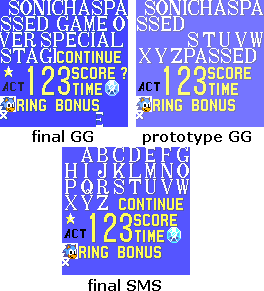
Submitted by: IceKnight The way everything is situated in the tile viewer is different for all 3 versions of Sonic 1. The Master System version has an entire alphabet which are then situated in their correct spots. They then decided to just create the whole word in the final Game gear game. The prototype version is half way there, with some bits written out with some leftover letters. The prototype doesn't include the 'CONTINUE', '?', Star or Chaos Emerald. The background colour is also a lighter colour in the prototype.
|
 |
|
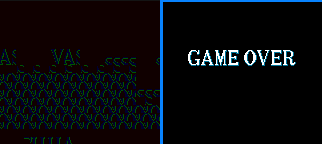
Submitted by: Rlan The Game Over screen is also screwed up because of this small change, as it's not even in the prototype Tile selection. The right picture is what it should look like. |
 |
|
Submitted by: Rlan The mountains are a slightly different hue. The prototype mountain, seen in the top image, are more purple, and a lot like the Master System versions. The final is more colourful, using some yellows and pinks in there. |
|
|
Sprite
changes
|
|
|