|
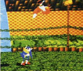
Submitted by: Rlan The first revision of South Island has a very different look to it, first of all, it has boundaries, although very different to the final, more like the ones from Flying Carpet. |
 |
|
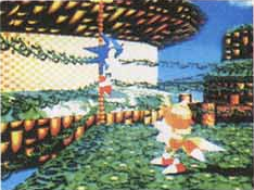
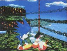
Submitted by: Rlan Sonic jumps to attack Tails. You'll notice that the background is different to the final version, or even version 2 of South Island. The 'rocky' areas are now semi-circular in shape at one end, while v.2 has blocky bits and the final has curved off rock. |
 |
|
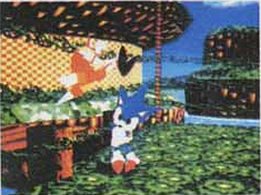
Submitted by: Rlan Sonic tackles Tails into the corner. That background is close to the final design, as it also has a big island in the background like that, but with some palms around it. |
 |
|
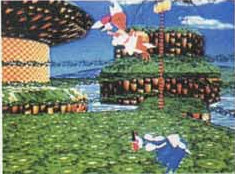
Submitted by: Rlan Like v.2, palmtrees make the corners of the arena, where the final just has boxing ring corners. |
 |
|
Submitted by: Rlan Most obviously is the floor, it's completely different to the final, checkered design. Although if you look closely, it looks like that texture is used for the outside grass of the arena. |
 |
|
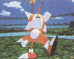
Submitted by: Rlan Here Tails is going a little pose, but in the final he doesn't do it like this. His arms are in different positions, and he has facial expressions to show his glee. |
 |
|
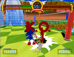
Submitted by: Rlan Heres the final level, you can see the large difference in floor texture, boundaries, and islands in the background. |
 |
|
South
Island V.1
|
|
|